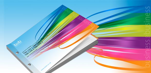
BtoB specialise in business support and development, as part of their nationwide Meet the Buyer events they required a standardised template for tender proposals.
Skillsets
- Template creation
- 3D brand element

BtoB specialise in business support and development, as part of their nationwide Meet the Buyer events they required a standardised template for tender proposals.

CosmiTec are a start-up business within the Nottingham University Institute for Enterprise and Innovation and were looking to launch a range of ‘cost effective’ silicone based products in the UK.
Crayfish Design were asked to develop a logo with the potential to encompass a range of products.
CosmiTec are looking to establish themselves as a core supplier for innovative scar prevention products in the UK.
Their first product release is planned to gain a significant foothold in a fledgling market. In conjunction with an eastern based supplier, CosmiTec intend to import, brand and promote a highly credible product in a currently under-competitive market.
The silicone gel had been developed for external application to create a barrier and help retain moisture around the affected area, and in doing so control the regeneration of scar tissue.
Our approach was to represent the natural healing process by creating a stylised scar formation within a pure water droplet as the main logo form.
This solution balanced the clinical perception of the product with a design that was easy on the eye, inoffensive and avoided any unsightly images of damaged skin or application. The marble-like form also naturally lent itself to be reproduced in a variety of colours, which enabled distinctive differentiation of the range of silicone gel based products.
The resulting brand image could be used on a variety of applications ranging from packaging and POS to web and technical bulletin sheets.

Evolve Consulting Services are a human resource consultancy that are employed by businesses to implement the individual development of their employees.
Crayfish Design were asked to develop a series of guides and questionnaires for a life transition tool – Testing the Water™.
Testing the Water™ is a series of practical guides that support you through particular life transitions. These publications aim to offer a helping hand to make a positive transition, enabling you to make effective choices and setting you up for success.
Collateral within the series will include a questionnaire and practical guide publications aimed at individuals gearing towards self-employment and retirement.
Building on the evolve brand solution, we developed a style for the guides that focused on legibility and ease of use to give the reader space to digest and reflect on the thought provoking questions.
The result was a clean typographic design style that balanced aesthetics with function. This format was then used across the series.
“Crayfish have developed a powerful brand identity to support the Testing the Water™. This is used in all of my books and questionnaires to support people through personal life transitions. My customers comment on how welcoming the books look, and how easy they are to read. The work at Crayfish has made such a difference to this. I would absolutely recommend them as a preferred designer.”
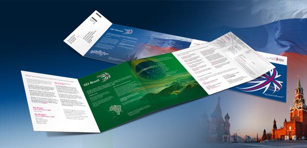
Go-Global is the UK Trade & Investment (UKTI) market visit programme for the East Midlands helping local businesses to get in touch with overseas decision-makers ready
to do business.
The requirement was for a redesign of the existing brand, starting with an overhaul of the logo (below) and taking it through all of the supporting collateral from stationery to event material, including mailers and exhibition banners. The first application of the refreshed brand was to be rolled out for the Go Global Brazil and Russia trade events.

In the UKTI’s capacity as a promoter of domestic businesses to a global market, it is important that they present themselves as a viable trade route in the face of ever growing competition.
The existing Go Global logo relied on a mix of iconography that referenced each of the target markets and led to a set of emblems that were based on heavily stereotyped imagery. This approach was becoming increasingly difficult to maintain as more target markets were being identified.
The need for a change was further justified in the realisation that the iconography was not suitable for its intended audience. This was based on the understanding that it was more important for the identity to reflect the element of UK export, as apposed to the identification of the target market itself.
The new logo was to provide a more distinctive image to be used across all of the sub-brands and emphasise the UK identity.
Reference to the relevant export market would be introduced through a more sophisticated use of photography that avoided the reliance on a cliched icon representation.


Quinta Essentia were, at the time, a startup company establishing themselves as a provider of additional resources and expertise for smaller and medium sized businesses. Their aim is to help SMEs create sustainable operational environments to encourage long term success, based on their mantra of; small changes can create large success.
Crayfish Design were asked to create a logo that would create awareness for their company and establish them in the market place. The initial thoughts surrounding aesthetics suggested that the logo would benefit from a strong use of colour and would be circular in form.
The logo was to be applied to a range of printed and electronic stationery formats such as business cards and email footers.
The company name ‘Quinta Essentia’ is a Greek term that means the fifth element, the one that binds together as a whole the four main elements of earth, fire, water and air. They believed that the main four elements moved in straight lines but that the fifth element moved in circles.
This analogy worked well with the four elements representing the sections of the client’s company with Quinta Essentia providing the adhesion and driving process.
We looked to use the Greek philosophy as a basis to construct a distinctive brand that would convey a sense of energy and dynamism.
To achieve this we incorporated a vibrant coloured flame for each of the elements and blended them together into circular swirl formation. The complexity of these rendered sections allowed us to specify a number of unique abstracts and were later used to define a set of templates for various marketing materials.
“When starting up a new business, it is often difficult to put into words, never mind imagery what it is that your new enterprise wishes to represent to your potential customers. What Crayfish Design came up with passed even my expectations, and truly represented the myriad of words and surreal explanations that I had in my head as to what I wanted to show. The design never fails to gain comments from my customers.”
“If you are thinking of refreshing, or creating a new company image, then I can thoroughly recommend the team at Crayfish Design to deliver above your expectations.”
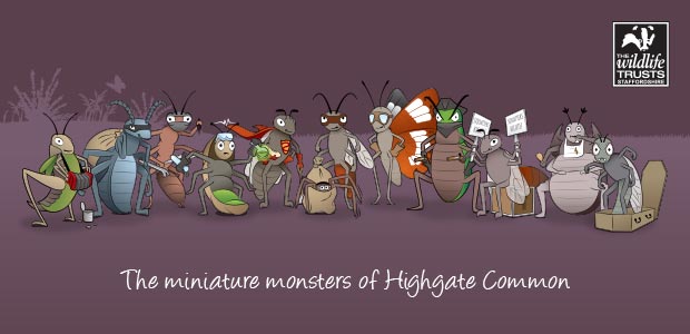
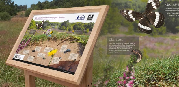
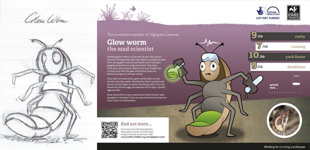
As part of the Wildlife Trust for Staffordshire’s conservation commitments, Highgate Common provided an opportunity to compose a unique set of interpretation panels aimed at informing the public about some very rare insect inhabitants.
We were to create a set of twelve interpretation boards and a leaflet, that would inform the local community and visitors of the activity and objectives for the trust achieve on the Common. For this particular project there was a need for a considerable amount of illustrative work, that would help highlight some unusual characteristics associated with the insects found on the Common
It was made clear from the start that Highgate Common is a site that owes its heightened status mainly to the diverse array of insect life. These creatures rely on the sandy earth and extensive heathland environment, which in turn helps attract some rather special birds at various stages of the year.
With this in mind we collaborated with the site’s senior warden to create a campaign entitled ‘Miniature monsters’ that focussed on – as you might imagine – some of the more unsavoury insect inhabitants.
In order to engage with a wider audience, we dedicated ten of the interpretation boards each to an insect. These boards focussed on the unusual and sometimes disgusting traits that were associated with that specific bug. Each board consisted of a photograph, illustrated character, actual size silhouettes and a set of scores based on predefined criteria, along with some introductory text.
“I have thoroughly enjoyed working with Crayfish Design. They were brilliant to work with, quick to respond, the standard of their work is very high and they grasped the concept of what we wanted from the project straight away. A completely positive experience with no complaints!”
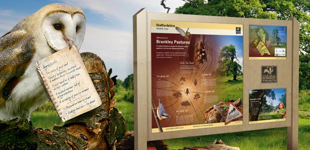
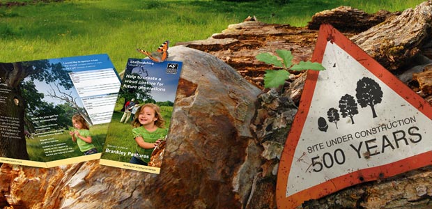
Design and implementation of signage and promotional materials for Brankley Pastures site. The project requirements included the design and production of interpretation panels, signage and leaflets.
“We really enjoyed working with Crayfish and with their excellent design skills we were able to provide a creative and inspiring interpretation project.”