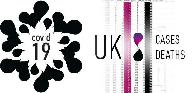
The first 60 days – A visualisation showing the number of confirmed cases and deaths in the UK’s as the Covid-19 pandemic has taken hold.
video – The first 60 days
A visualisation showing the number of confirmed cases and deaths in the UK’s as the Covid-19 pandemic has taken hold.
With all the bar and line charts being used to represent the statistics – we have visualised them in a different way and to give more emphasis to the escalation of the pandemic. Each teardrop represents the cumulative totals and the rotation speed reflects the growth rate and curve.

We used black tears to construct a Covid-19 virus shaped logo as they symbolise the loss of someone.
View the infographic animation.

