Loughborough Town Deal were looking to visually enhance their Town Investment Plan (TIP) submission to HM Government – for nearly £32m of funding that could help transform Loughborough into the future.
The plan included an array of projects intended to help people and local areas – projects that would not only change how the town looks and functions, but also to help our communities improve their skills, find employment, and grow their businesses.
Deliverables
The plan was to take the form of an A4 brochure, summary and appendix documents, and use a combination of local photos, charts and maps to illustrate the key aspects of the town that would benefit. Apart from the initial function of funding application, these documents would be instrumental in helping to engage and communicate the plans to the local community.
They would be available as printed materials and as fully accessible PDFs on the website.
Skillsets
- Brochure design and layout
- Illustration and icon design
- Map construction
- Accessibility PDFs
Concept and understanding
Working with the Loughborough Town Deal (LTD) partner Charnwood Borough Council, Crayfish Design were asked to utilise the LTD logo and website as a starting point from which to create a format that would express the Town Investment Plan’s message.
The designs needed to reflect different aspects of the town and show the full range of economic and social diversity that it has – balancing the existing positive infrastructure and aspects that have high county, national and global value with areas of social deprivation that would benefit hugely from a successful award.
Furthermore, consideration with regards to clarity and accessibility was an important factor in the design.
Solution
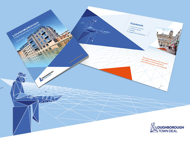
To capture and build on the style of the LTD brand we utilised the triangular construction of the logo to form structural building blocks for the brochure.
This faceted format developed into a style that was adaptable and that we could use to create representations of iconic parts of the town such as the ‘Sockman’ statue or simple symbols.
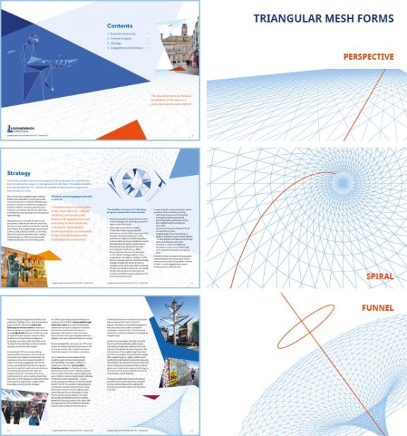
We also used triangular shapes and tessellations to link the images and elements through a combination of connected pathways and perspective angles.
Triangular Forms

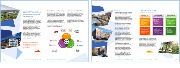
The design used a combination of supplied local photos, with iconography to reflect the focus areas – together with a range of charts and maps that were reconstructed.
For clarity and legibility we employed predominantly white backgrounds with a high contrast for text, combined with large font sizes to set a clear structure so that it was suitable for screen readers and adhere to government accessibility standards.
Brochure Covers

Example Spreads

What the client said:
“Crayfish Design quickly understood the brief given to them and were able to deliver within the short timeline required. They used creativity in their design but understood that the document being produced was of a serious nature and developed appropriate design and graphics solutions. Flexibility and responsiveness was a real feature of Crayfish’s relationship with the client and made working with them very easy and productive.”
