Award winning wedding photojournalist Ian Bursill, contacted Crayfish Design to refresh his logo and brand identity.
As an established reportage wedding photographer Ian Bursill is highly regarded within his industry, merited with a distinct style and exquisite ability to capture the moment. Ian was looking to change the emphasis of his existing logo in order to more accurately portray the nature of his talent.
Deliverables
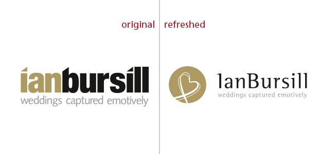
The existing logo was purely typographical, so as part of the transition Ian was keen to explore the potential for a motif that would allow him to be more versatile in developing his company brand.
To retain a familiarity of the brand and to extend the longevity of existing material, It was agreed that Crayfish would utilise the existing gold, black and white colouring.
Skillsets
- Logo and brand identity
- Social media imagery
- Concept and understanding
It was imperative that Ian’s name should remain a significant element within the final design. However, the solid block aesthetic of the existing typography failed to reflect the personality and emotive aspects that were so inherent within his work.
This set of circumstances helped to define our direction in creating a logo; that was more refined and engaging; embodied the essence of a wedding; highlighted the empathy involved in Ian’s timing in capturing significant moments; exhibited a timeless quality. It was also important to keep it relatively simple to ensure that it would work across a variety of media and allow for a flexibility within the brand going forward.
Solution
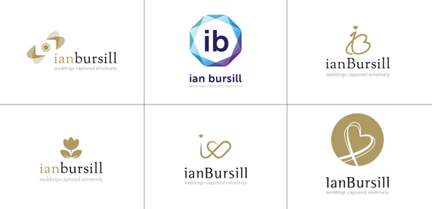
Our initial creative phase was to present a range of simple logo designs looking at combining some of the many different aspects, from his initials, traditional representations of love such as hearts and diamonds to the physical framing nature of the camera and looking through the lens.

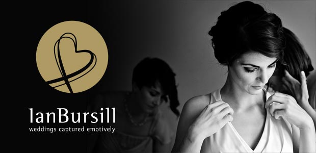
The chosen logo design combined a pair of entwined ribbons forming a knot in the shape of a love heart and letter ‘B’ for Bursill, which were cropped within a circle to relate back to the viewfinder of a camera lens.

The motif by itself could be used as mark or seal of quality without distracting too much from the photographs and also for a range of social media branding.
What the client said
“I’m a documentary wedding photographer and I document my couples weddings with little intrusion and no direction or staging. My ethos is to capture the wide range of emotions on display at a wedding – so real people, real moments, real weddings.”
I also used to work in the print and advertising industry so have a creative background and an appreciation of good design. My self created logo that had stood me in pretty good stead for 9 years was in need of a refresh. I needed it to strongly reinforce my approach, look a little less masculine & appeal to my target market.
I know a lot of designers, but the only one that was ever in my mind to hire for new branding was Jim & the team at Crayfish Design. I’ve admired their work for years having been shown his work by a colleague when I worked in the advertising industry in Leicester.
The process started with a meeting so that I could give a brief and Jim could get to understand my business. He asked loads of questions about my company ethos, values and my target market. Before he’d left, he had a collection of doodles on his pad as he was thinking of ideas while talking.
Within a week or so I had an email containing some creative logo concepts. After canvassing the views of others and settling on the design I wanted to proceed with, Crayfish Design made some tweaks and the new branding was ready for launch. A thoroughly painless process!
Crayfish’s ability to understand what my business is all about and translate that into branding that works is fantastic. I’m more than happy to recommend them to anyone I know.”
Ian Bursill, Wedding Photojournalist
See some more of Ian’s work at bursill.com
