

Colour gives your brand personality, it influences the mind on both a conscious and subconscious level, creating a reactive and often emotive response.
A brand is about communicating your company’s values and raising your profile, so the use of colour can play a critical part in telling your story. When employed correctly, colour can reward your brand with immediate recognition, a sense of purpose and standing; but it can also have a negative impact with the potential for audience dissociation, confusion and even distrust.
Colour use across brands – Some of the clients we have worked with

Colour has a narrative and selecting the right colour/s for your brand is an essential part to the design process. When defining a key colour or palette, it is important to understand how a brand intends to nestle within the marketplace. Certain colours can predominate the more traditional business sectors, either through a reluctance to challenge the norm, mimic competitors or to align with partners. In contrast, businesses associated with emerging markets or niches tend to opt for palettes based on contemporary consumer trends, or alternatively, generate colour schemes that deliberately set out to oppose established preconceptions. Selecting the primary brand colour can therefore, be a multifaceted undertaking that has short and long-term implications.
Colour influences
Our reaction to colour is influenced by many factors including:
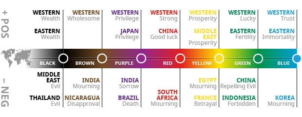
Cultural – As individuals we are heavily influenced by the society and culture that we live in. Colour associations are different across the world and although common interpretations exist, some colours could be regarded as an affront or even completely taboo.
Colour associations around the world
Environmental – In accordance with our surroundings, specific colour associations provide us with clues to warnings, safety, ripeness, health and strength. There are certain colourations that assume priority on an instinctive level, such as reds, oranges and yellow with black. The influence of these colourations can be extremely powerful and are often utilised to enforce public information messages that are recognised worldwide.
Natural colour associations

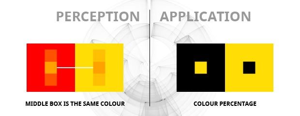
Contextual – Our perception of colour can be affected by other colours that surround it and even how abundantly/sparingly it is applied. For instance, if yellow were applied to a large area that dominated everything around it it could be perceived as a warning, but if used in an intricate manner against a dark colour it may represent something that is precious.
Colour perceptions
As important as it is to give consideration to influences that can impact your audience, it is equally important to remove your own preconceptions. The psychology of colour is well documented, with certain colours known to affect our mood and state of mind. Individually we learn to associate emotion and meaning to certain colours with reference to a unique range of experiences, and this interpretation of colour is likely to shift throughout our lives. The range of our community is no longer restricted by our locality, meaning that our own influences could just as likely stem from a source many thousands of miles away, as it could from a leaflet landing on your doormat. As with any brand development activity, it is always vital to test your use of colour on a sample audience before you commit.
Defining your brand colours
Colour is a powerful tool that can enable an image to traverse the landscape of consumer conciousness to enhance, reposition or event totally reinvent brand delivery.
A colour palette will pervade every aspect of a brand … its impact on an audience should not be underestimated. A badly conceived colour palette can expose your brand to unnecessary restrictions, lead to inconsistent colour reproduction or present a facade that simply doesn’t correspond with your offering.
Crayfish has been established since 2004 and during this time we have gained a considerable amount of experience in brand creation. Our intent is to produce colour harmonies that form a comprehensive and dutifully considered brand palette, selecting colour schemes that will satisfy your strategic vision whilst ensuring that they are robustly tested for feasibility in a range of media.
When executed correctly, the application of colour should galvanise your marketing and furnish your brand with a strong sense of personality.
Whether you have an existing brand or are considering a new one, get in touch to see how we can help create a colour scheme to enhance your customer engagement.