Toolkit for internal comms – Travelodge

Travelodge - HR brand toolkit

Travelodge is the UK’s largest independent hotel brand with more than 500 hotels covering the UK, as well as parts of Ireland and Spain. With a vast multinational workforce, their HR department required a more efficient means of communicating with their employees.

Deliverables

To develop an internal brand toolkit that will enable Travelodge HR to produce cost effective comms solutions internally, with the aim that only print and publishing requirements should be outsourced.

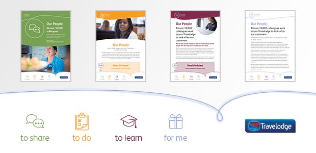
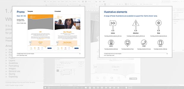
The internal brand needed to fit with, yet be distinguishable from their public brand and tone of voice. It was to be delivered to Travelodge HR in the form of a templated toolkit for a range of collateral including letters, presentations, email signatures, posters and certificates.

Skillsets

  • Branding
  • Design and layout
  • Template creation
  • Guideline documentation
  • Training

Concept and understanding

Our initial concepts for the look and feel of the internal brand, were steered by a sense that it should reflect the customer focused material, so that it should not look out of place in instances where it may be displayed in areas accessible to the public.

The conceptual/developmental stages were pivotal in defining a coherent brand, with the emphasis behind these stages evolving throughout the process, eventually leading us down quite a slightly different path to the one we had originally started on.

Solution

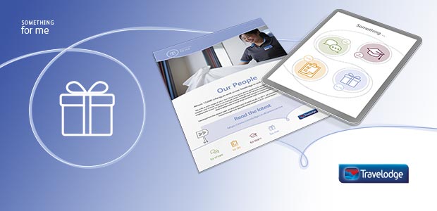
What had remained constant throughout the developmental phase was a reference to four main areas of engagement. It was this element mentioned in our first meeting that had ultimately defined the entire brand based on four icons, in conjunction with a free-flowing aesthetic extracted from the notion of a ‘journey’.

Through the creation of the toolkit we provided a set of predefined formats and artwork elements to allow Travelodge to easily implement their own communications. Our objective was to allow the client to focus on applying the content rather than having to consider design or formatting issues.

Travelodge - HR brand toolkit document examples

It was originally proposed that the templates may be generated in a suite of online software that the eventual users had used previously, but after extensive testing in these alternative software packages we determined that this option was not practical going forward. Therefore, the template files were created in Adobe InDesign and optimised for ease-of-use.

Travelodge - HR brand toolkit training

The internal staff were then given training by a Crayfish Design representative over the course of a few hours and supplied with a bespoke instruction manual for reference.

About the client

For more information about Travelodge visit their website: travelodge.co.uk

Logo branding – Ian Bursill

Award winning wedding photojournalist Ian Bursill, contacted Crayfish Design to refresh his logo and brand identity.

As an established reportage wedding photographer Ian Bursill is highly regarded within his industry, merited with a distinct style and exquisite ability to capture the moment. Ian was looking to change the emphasis of his existing logo in order to more accurately portray the nature of his talent.

Deliverables

The existing logo was purely typographical, so as part of the transition Ian was keen to explore the potential for a motif that would allow him to be more versatile in developing his company brand.

To retain a familiarity of the brand and to extend the longevity of existing material, It was agreed that Crayfish would utilise the existing gold, black and white colouring.

Skillsets

  • Logo and brand identity
  • Social media imagery
  • Concept and understanding

It was imperative that Ian’s name should remain a significant element within the final design. However, the solid block aesthetic of the existing typography failed to reflect the personality and emotive aspects that were so inherent within his work.

This set of circumstances helped to define our direction in creating a logo; that was more refined and engaging; embodied the essence of a wedding; highlighted the empathy involved in Ian’s timing in capturing significant moments; exhibited a timeless quality. It was also important to keep it relatively simple to ensure that it would work across a variety of media and allow for a flexibility within the brand going forward.

Solution

Our initial creative phase was to present a range of simple logo designs looking at combining some of the many different aspects, from his initials, traditional representations of love such as hearts and diamonds to the physical framing nature of the camera and looking through the lens.

The chosen logo design combined a pair of entwined ribbons forming a knot in the shape of a love heart and letter ‘B’ for Bursill, which were cropped within a circle to relate back to the viewfinder of a camera lens.

The motif by itself could be used as mark or seal of quality without distracting too much from the photographs and also for a range of social media branding.

What the client said

“I’m a documentary wedding photographer and I document my couples weddings with little intrusion and no direction or staging. My ethos is to capture the wide range of emotions on display at a wedding – so real people, real moments, real weddings.”

I also used to work in the print and advertising industry so have a creative background and an appreciation of good design. My self created logo that had stood me in pretty good stead for 9 years was in need of a refresh. I needed it to strongly reinforce my approach, look a little less masculine & appeal to my target market.

I know a lot of designers, but the only one that was ever in my mind to hire for new branding was Jim & the team at Crayfish Design. I’ve admired their work for years having been shown his work by a colleague when I worked in the advertising industry in Leicester.

The process started with a meeting so that I could give a brief and Jim could get to understand my business. He asked loads of questions about my company ethos, values and my target market. Before he’d left, he had a collection of doodles on his pad as he was thinking of ideas while talking.

Within a week or so I had an email containing some creative logo concepts. After canvassing the views of others and settling on the design I wanted to proceed with, Crayfish Design made some tweaks and the new branding was ready for launch. A thoroughly painless process!

Crayfish’s ability to understand what my business is all about and translate that into branding that works is fantastic. I’m more than happy to recommend them to anyone I know.”

Ian Bursill, Wedding Photojournalist

See some more of Ian’s work at bursill.com

Event theme branding – LATi Showcase

As part of the 2016 Leicester Business Festival, LATi hosted a showcase event entitled ‘From earth to space & beyond’.

The showcase attracted over 100 attendees and 40 exhibitors containing representatives from Loughborough University Science and Enterprise Park (LUSEP) as well as LATi members. The event highlighted the rich diversity of expertise within the LATi membership, including space science and engineering, automotive, industrial design, bioscience, life sciences, energy, materials science, information technologies, business services, and more.

Below is our short animated sequence for the event …

Deliverables

As design sponsors for the event, Crayfish Design suggested the need for a brand to galvanise the separate elements into a cohesive theme. This approach not only helped LATi to promote the event to their membership and potential visitors, but also gave the organisers some criteria in determining who they would ask to speak at the presentations.

Skillsets

  • Logo and brand identity
  • Animated logo sequence
  • Presentation template
  • Exhibitions and events flyers
  • Digital communication templates

Concept and understanding

The final concept utilised a figure element that inhabits the LATi logo identity and was replicated to form a circular configuration that symbolises the LATi community of members. The resulting form was then used to emphasise the vast physical scalability that is transcended by science and technology in the search for understanding and advancement – from subatomic particles via the iris of an eye and through to a space hub formation with outreaching connections. Colour was employed in an array of softly morphing, yet vivid hues.

Solution

The brand was applied to a wide range of traditional print and digital formats for use at the event and online through social media routes. This included:

  • banner stands
  • posters
  • event leaflets
  • exhibitor lists
  • event badges
  • social media templates
  • presentation templates for the speakers


In addition to the above applications the theme was also used on 200 promotional gift packs that were to be gifted to each of the attending exhibitors, plus an animated sequence that was employed as an introductory piece for the presentations and online promo to extend awareness of the event through social media platforms.

What the client said

“The benefit of working with Crayfish Design on this project was their attention to detail and careful project management. Creating material for an event is never as simple and straight-forward as it looks, but it all ran incredibly smoothly. We were thrown a few curveballs. However, Crayfish Design took all the amends and changes in their stride. Nothing was too much trouble”

“The animated sequence was a wonderful surprise: it showed the design imagery unfolding, telling the “earth to space and beyond’ story in visual form. It cleverly set the scene, creating an exciting introduction to the conference.”

Gillian Hunter, LATi Manager

“Thanks to Crayfish Design, we were able to deliver a professional looking event that the LATi community and our supporters were proud to be associated with. We wouldn’t hesitate in recommending Crayfish Design for brand identity and design projects.”

John Duncan, LATi Chairman

Read the full client testimonial here

Charity shop – Staffordshire Wildlife Trust

To assist Staffordshire Wildlife Trust in setting up their first high-street charity shop. The shop is intended to support their ongoing fundraising activities and also raise awareness of the work they do in maintaining sites that are strategic in wildlife conservation.

Deliverables

To produce a proposal for the SWT’s first high-street outlet that will help determine a template for any future projects of a similar ilk. Crayfish Design will advise and help co-ordinate the trust on their own responsibilities, as they gain experience in implementing such a project.

Ultimately we will provide all of the relevant artwork, whilst corresponding with suppliers and ensuring that the trust has gained local administrative approval where necessary.

Skillsets

  • Concept proposals
  • Design and layout
  • Illustration
  • Client-Supplier co-ordination
  • Project management of deliverables

Concept and understanding

Even though we had done many projects for the trust before, it was imperative that we transferred the core values and messages into materials that would be effective in a setting that was unfamiliar to the SWT.

The trust was experienced in creating a commercially focussed environment to a captive audience at a nature reserve. This experience needed to be channelled into creating a shop that would be part of a high-street community and would inform customers of their vital conservation work.

Solution

We defined everything from the sign above the door to the colour on the walls, using the existing guidelines as a basis and expanding on them to create a theme that would merge the SWT’s core message with a commercially viable offering.

A combination of permanent, semi-permanent and temporary fixtures were utilised to create a look and feel that could be altered from season-to-season or even week-to-week, so that the staff could tailor the displays accordingly. This would also allow the shop to evolve as the trust gleaned more information regarding customer habits and feedback.

What the client said

“Crayfish Design did a fantastic job designing the signage for our new charity shop and made it really stand out from the rest. They helped us to create a unified look that reflects our charitable aims and values.”

“They are reliable, met all our tight deadlines and are easy to work with. I’d thoroughly recommend them.”

Liz Peck, Communications officer, Staffordshire Wildlife Trust

Website refresh – Evolve Consulting Services

Redeveloping an existing website and migrating it to a content managed environment to allow the site owner more control. The new site will improve natural SEO results and enable a more dynamic use of content.

Deliverables

Crayfish Design were tasked with transitioning the essence of the old static HTML site into a new CMS-based system. The updated site will be compatible with a range of web enabled devices and will also increase SEO performance.

Skillsets

  • Design and layout
  • HTML, CSS and PHP coding
  • CMS integration

Concept and understanding

For the previous 10 years Evolve Consulting Services Ltd had relied on a website that used a static content template and had virtually no search engine optimisation. Changes to content had to be implemented by somebody who was familiar with HTML coding, and that meant every change would be subject to a fee. As a result, the site was failing to entice any interest and was not delivering any meaningful benefits to the company.

Since the site’s original incarnation, web-based media has moved on considerably and with it the expectations of the internet community. Our job was to add functionality to the system that would emphasise the value of its content and would display it to users in a more appropriate format.

The client was generally happy with the look and feel of the existing site, with that in mind we set about creating a set of visuals that would reuse the core elements in a template that would work more effectively in a modern context.

Solution

As Evolve is a small company with no dedicated marketing personnel, we decided that the day-to-day administration of the site needed to be as simple as possible.

We discussed specific functionality requirements with the client, helping us to assemble a solution that would allow the client maximum control with basic system knowledge.

The content fell into three sections; Business, Enterprise and Personal – each of which had its own distinct branding. We decided that the branding would need to be applied with minimal client input and integrated a dynamic feature within the template, that would filter colour themes, menu options and testimonial quotes automatically.

Last, but not least, we added stylesheet coding that would optimise the page format in response to the viewers device i.e. PC/mobile/tablet.

As a result the client now has a site that they can add content to at will, at no further expense to their business and is setup work on all manner of web enabled devices.

What the client said

“Crayfish Design has reinvented and refreshed my website so that it is possible to be viewed from all technical devices with ease and is becoming more visible on Google. They did a tremendous job of refreshing my brand identity and website experience so that it is still congruent and integral to the brand, but is even more engaging and impactful than before. I am very pleased with the work that they have done and I would totally recommend Crayfish Design as a provider to establish or reinvigorate your brand identify and website experience.”

Cathy Brown, Director, Evolve Consulting Services Limited

Reference guide – Sue Ricks

Sue Ricks is an independent therapist. As part of her considerable knowledge in her vocation Sue provides guidance and training for other therapists, including releasing several reference publications for distribution.

Skillsets

  • Brochure layout
  • Illustration
  • Branding

What the client said

“Crayfish Design are super to work with. I have worked with them for many years now and am delighted with all of the projects that they have done for me. I find them really approachable, very professional and brilliant at what they do. I really value the work that they have done for me, ranging from charts, CDs and DVD, to books and web design images and much more. I love their almost intuitive touch to their work and feel lucky to know and work with such special people.”

Sue Ricks School of Complementary Therapies

Logo and branding – Wave

To create a new logo and brand for a public sector voluntary scheme initiative.

Skillsets

  • Logo design
  • Definition of brand elements

Branding and collateral – Zenobia Consulting

We were asked to create a complete new brand and supporting collateral for a startup company. The brand needed to reflect Zenobia’s core values including the phrase ‘Simplifying Complexity’.

Skillsets

  • Logo design
  • Stationery design
  • Collateral layout and branding

What the client said

“Crayfish Design are a responsive and thoughtful design partner. As a small but experienced management consultancy, and with a marketing background myself, I felt it was vital to have a corporate identity which reflected our values and gave an instant impression of what Zenobia Consulting is like to work with. I wanted something that was bold and clear and that reflected our focus on ‘Simpifying Complexity’ for our clients.”

“They patiently to my vision for Zenobia Consulting and translated this into three possible corporate logos, one of which I really liked.  From then on it was a process of tweaking the colour and details, and I found them to be very attentive and patient with my exacting requirements and focus on the tiniest of details. I am happy to recommend Crayfish Design.“

Lena Sabbagh, Director, Zenobia Consulting

GUI integration – Learning@college

Learning@college had an login area for users of their online e-learning tools. We were tasked with creating a new look and feel, from creating the graphical elements to providing the new CSS code necessary to overlay an established system with the new aesthetic.

Skillsets

  • Icon creation
  • User interface rebrand
  • CSS and creation of stylesheet toolbox for integration

Brand and overview brochure – Envirogen Renewable Solutions

Envirogen Renewable Solutions is a new company dedicated to delivering more environmentally-friendly heating and air conditioning solutions. We had to create a unique brand for an increasingly competitive market.

Skillsets

  • Brand definition
  • Logo creation
  • Design and layout