There is always a point in every brand’s life when it becomes apparent that it needs to change – the important thing is that you identify when that time is and address it accordingly.
For many years now, Crayfish has championed an ongoing Refresh campaign. We believe it is important that our clients not only get the right solution for their own unique requirements, but also that they are receiving a service that they feel comfortable with.
The Refresh philosophy is something that we practice in relation to our own brand at Crayfish. We regularly review our brand using as many different forms of research as we can, these generally consist of client/public feedback and competitor analysis, combined with a summary of our position in the market.
Our latest review focussed on the logo and how it portrayed the company, both in situ with our collateral and independently. The conclusion that we reached was that it no longer accurately represented what we offer. When Crayfish was first formed the majority of our work was print-based, as time has gone on that synopsis has not remained true as we have steadily incorporated multi-media into our remit.
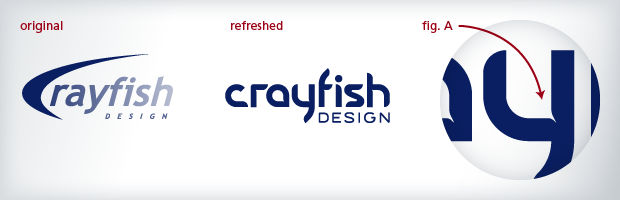
With this in mind we went about deconstructing the existing logo to determine what elements remained valid. What we ended up with was a logo that retained the compositional integrity of the original but now incorporated the previously stylised ‘C’ within a totally bespoke font. This new font took influence from an abstract interpretation of the crayfish claw and placed it within a digital context.
Every detail counts (see image above fig. A above) – Enhanced junctures evolved from the abstract interpretation of a crayfish claw, help to pronounce the clarity of the letters at a reduced scale and give extra character to the logo when increased in size.