Discover Charnwood branding – Charnwood Borough Council

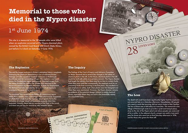
Charnwood Borough Council sought to promote the unique landscape, character and wealth of attractions within the borough. The aim was to the entice the residents of Charnwood and visitors to explore what the area had to offer, so generating an increase in local footfall and business opportunities. The theme and focus of ’Discover Charnwood’ was to be applied across several sub-categories including; ’Outdoors, Heritage, Business, Shopping, Accommodation, Sport & Leisure and the Sciences.

Deliverables

Crayfish Design were asked to create the logo and overall brand for ‘Discover Charnwood’, and to provide design assets for other partners to showcase the campaign through video, a bespoke website and heritage guide.

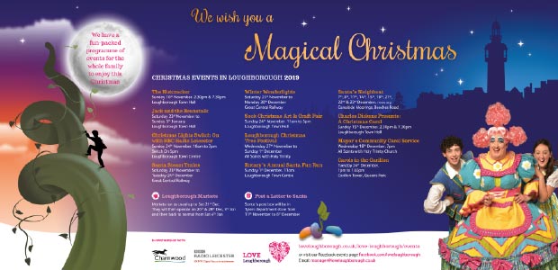
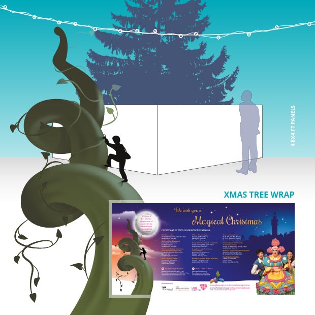
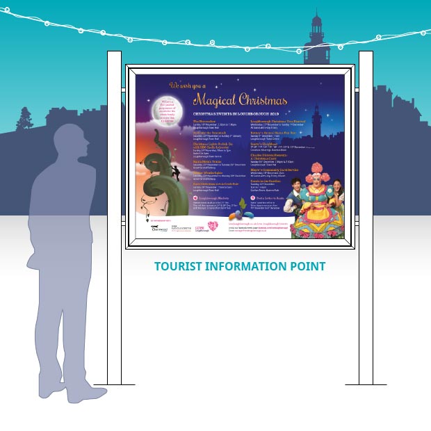
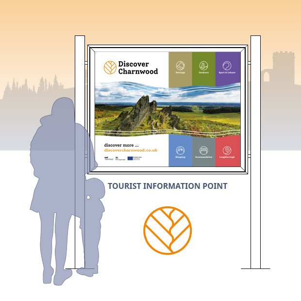
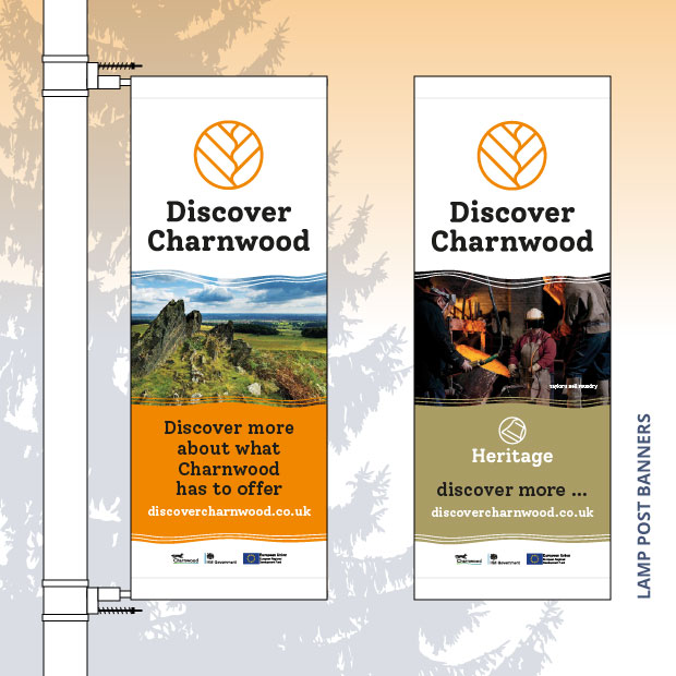
In addition to this, the brand was to be applied across various media including the Tourist Information Points (TIPs), a range of posters and banners for footfall locations, along with templates for social media posts for promotion activities.


Background

Charnwood is a diverse area with unique geological features and natural character – from the precambrian rocks it has a history of quarry work and the first recorded discovery of the Charnia fossil – an early sea based life-form that lived nearly 600 million years ago. Together with several woodland areas, it provides a rich tapestry of historical locations and rugged environment for locals and visitors to explore.

In addition, aspects of human inspiration and endeavour combine to further add multiplicity to Charnwood’s story; such as diverse heritage, expanding business developments, scientific research, advanced technological prowess, through to an internationally renown sport and high education regard. It is these developments that will shape the future and understanding of Charnwood. It is important therefore, that the brand also has an openness and forward looking approach, that is adaptable and open to discovery.

Skillsets

  • Logo design and branding
  • Signage
  • Poster design
  • Photography and video
  • Social media templates

Concept and understanding

To capture an element the represented Charnwood in the logo design was imperative – however, it needed to be not too specific to any particular location that it might give favour towards some attractions over others.

In addition, consideration over clarity and legibility lent towards an approach that would employ a simple and concise form. A logo that was easy to identify at a distance and so have clear application in the environment, would also help it to work across a wide range of media and to those of smaller scale.

Additionally, the diversity of the categories and use of photography associated with the brand would also navigate towards the application of a simple generic form as the main motif.

Solution

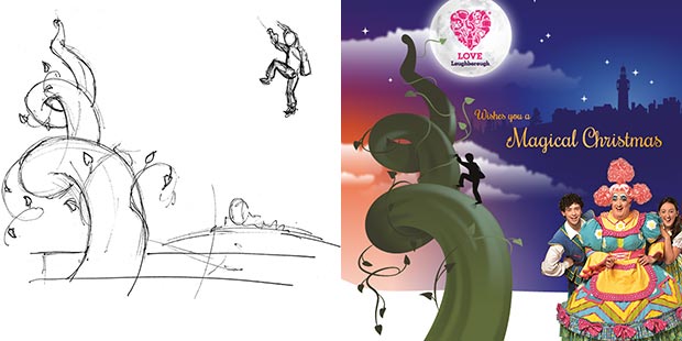
With so many unique factors to consider and places to promote, we decided to explore how we could best reflect the essence of the local landscape, the contours and characteristics found within Charnwood. Furthermore, we identified options that would be conducive for referencing other avenues and future associations. From this we concluded that the task was to find a system for communication, a vehicle with a single overarching identifier as the primary logo rather than a depiction of a specific location and then to use supporting elements to distinguish individual categories.

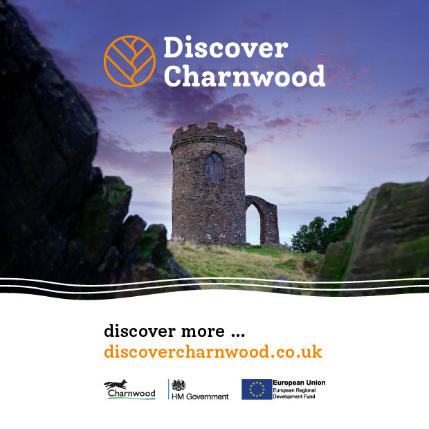
The selected concept utilised a logo design with the Charnia fossil as its main visual representation. It gave it a unique and almost timeless reference, which also had worldwide acclaim and by itself had a story of discovery to tell. Discovered in the 1950’s by local children the fossil had a simple organic form with a flowing segmented shape, similar to that of a feather or stemmed plant. However, by itself the fossil had a tall and thin shape, not too fitting for a logo design!

Our solution was to capture the identifiable feature that made the fossil or category instantly recognisable, an exploration of which gave rise to the focal mark approach.

The design exhibited both a contemporary and classic format built on the structural characteristics and repeating pattern formed by the segments. With an asymmetrical arrangement, the two halves balance each other, forming what looks like a river meandering through the landscapes – a reference to the Soar Valley itself. Composed within a circle, the symbol acts as spotlight or focal mark.

The close-up adds to the search and sense of discovery and was a format that was replicated across each of the categories with simple line based icons that could be used as destination identifiers. The minimal line aesthetic has then been extended throughout the supporting category icon set. These icons were also kept simple, abstracted and asymmetrical to complement the overall look and feel.

The Discover ‘Charnwood’ typography was likewise adapted to focus on each of the specific sectors and used as part of a family of logos.

In addition to the logo design, we created a theme for the campaign as a whole, which led to a functional set of brand guidelines to provide style guide.

This was then applied across a range of promotional materials including; various signage requirements, posters etc. plus digital formats for website and social media use.


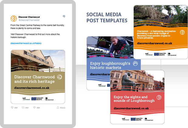
The social media templates allowed the client to quickly create and compose images for posting.


The campaign was supported with a range of video and photographs that were initially created for the Our Charnwood campaign.

What the client said:

“The Council was seeking to create a destination brand for Charnwood that brought the borough’s fascinating story to life and we needed an identity that spoke both to the borough’s natural assets and also its industrial heritage while having a hint of its cutting edge future. Thanks to Crayfish, we feel the final branding chosen for Discover Charnwood has captured the essence of the borough and connected to all of those points. The branding has been used across print and digital assets with everything from the website and social media and to lamppost banners and leaflets.

Discover Charnwood won the best marketing campaign in the Leicestershire Promotions Tourism and Hospitality Awards 2022 following its launch in March 2022 and the branding was a key element of this. Our thanks go to Crayfish for an excellent piece of work.”

Mike Roberts, Marketing Manager – Charnwood Borough Council

This Christmas – Charnwood Borough Council

This Christmas - Shop Safe Shop Local - Xmas tree wrap

Each year Charnwood Borough Council and Love Loughborough actively promote the festive activities throughout the town and usually align with the pantomime at the Loughborough Town Hall. However, with the COVID-19 pandemic having made a significant impact on the planned festivities the message was very different.

The focus was towards shopping safe and keeping it local.

Deliverables

Crayfish Design were asked to create a fun, character based theme for the Christmas tree wrap that would build on the existing Shop Safe – Shop Local brand and support the safety message of ‘Wash hands, Cover Face and Make Space’.

This Christmas - Shop Safe Shop Local - Xmas tree

In addition to this, the design would be applied across different media including the Tourist Information Points (TIPs), crowd barriers, posters for footfall locations and social media posts.

Skillsets

  • Illustration
  • Signage
  • Poster design and layout
  • Social media

Concept and understanding

The ‘This Christmas’ message ‘Look for your local businesses online or in the high street’ was the primary phrase. A clear and simple message with the objective of changing consumer habits away from large national retail and online purchases and to encourage people to support their local community. As the campaign was to cover all independent businesses across Charnwood, it needed to be generic and so not identify or favour any particular shopping method or outlet.

Giving the consumer confidence to shop safely in the high street again was vitally important to the local economy. It was therefore, imperative to communicate the shop safe aspect but still add some traditional Christmas charm and an element of fun.

Solution

In creating the ‘this christmas’ theme we developed a series of cartoon based traditional Christmas characters to give a sense of comfort and to highlight the safety messages. To reflect the ‘Cover Face, Make Space and Wash hands we had Rudolph with a safety mask, Snowmen keeping their distance with a broom as a measure – and a pair of mischievous elves using a hand sanitiser bottle.

This Christmas - Shop Safe Shop Local characters - cover face - make space - wash hands

To provide the campaign with a local grounding, these were composed on to a simple snow scene with silhouettes of Loughborough town centre, the Carillon monument and other distinguishable features with a distant Old John monument to give coverage across Charnwood.

From our initial sketches we formed a set of illustration groupings which meant that we could be flexible with the format and adjust the scale and composition to fit the requirements.


This Christmas - Shop Safe Shop Local - Placards

In addition to the Christmas tree, signage and posters, the design was adapted as a set of placard boards for retailers to promote their business on social media posts.

What the client said:

“Charnwood Borough Council tasked Crayfish Design to create a fun, festive design to work alongside the Shop Safe, Shop Local campaign. The artwork was to encourage residents to shop local and get into the spirit of Christmas while remembering to stay safe.

The designs were required to be adapted for tourist information points, tree wraps, barrier banners, posters and digital media.

Crayfish Design worked extremely well with every aspect of the campaign, producing draft plans in a very tight timeframe which captured the design brief wonderfully. Working in consultation with the council team, they fine-tuned the design and we benefitted from their expertise and advice to produce the best material for the requirements.

It worked well as a complete design with a good mix between the shop safe message and a Christmas feel. The use of the 3D characters to enforce the ‘Hands, Face, Space’ messaging was superb.

The professionalism, excellent customer communications, design quality and insight were remarkable, and we will definitely look to use Crayfish for future projects.”

Catherine Thorne, Senior Communications Officer – Charnwood Borough Council

Town Investment Plan – Loughborough Town Deal

Sockman illustration Loughborough Town Deal Brochure

Loughborough Town Deal were looking to visually enhance their Town Investment Plan (TIP) submission to HM Government – for nearly £32m of funding that could help transform Loughborough into the future.

The plan included an array of projects intended to help people and local areas – projects that would not only change how the town looks and functions, but also to help our communities improve their skills, find employment, and grow their businesses.

Deliverables

The plan was to take the form of an A4 brochure, summary and appendix documents, and use a combination of local photos, charts and maps to illustrate the key aspects of the town that would benefit. Apart from the initial function of funding application, these documents would be instrumental in helping to engage and communicate the plans to the local community.

They would be available as printed materials and as fully accessible PDFs on the website.

Skillsets

  • Brochure design and layout
  • Illustration and icon design
  • Map construction
  • Accessibility PDFs

Concept and understanding

Working with the Loughborough Town Deal (LTD) partner Charnwood Borough Council, Crayfish Design were asked to utilise the LTD logo and website as a starting point from which to create a format that would express the Town Investment Plan’s message.

The designs needed to reflect different aspects of the town and show the full range of economic and social diversity that it has – balancing the existing positive infrastructure and aspects that have high county, national and global value with areas of social deprivation that would benefit hugely from a successful award.

Furthermore, consideration with regards to clarity and accessibility was an important factor in the design.

Solution

To capture and build on the style of the LTD brand we utilised the triangular construction of the logo to form structural building blocks for the brochure.

This faceted format developed into a style that was adaptable and that we could use to create representations of iconic parts of the town such as the ‘Sockman’ statue or simple symbols.

We also used triangular shapes and tessellations to link the images and elements through a combination of connected pathways and perspective angles.

Triangular Forms

Loughborough Town Deal – Sockman illustration - Perspective lines - Mesh funnel

The design used a combination of supplied local photos, with iconography to reflect the focus areas – together with a range of charts and maps that were reconstructed.

For clarity and legibility we employed predominantly white backgrounds with a high contrast for text, combined with large font sizes to set a clear structure so that it was suitable for screen readers and adhere to government accessibility standards.

Brochure Covers

Loughborough Town Deal – Brochure Covers

Example Spreads

What the client said:

“Crayfish Design quickly understood the brief given to them and were able to deliver within the short timeline required. They used creativity in their design but understood that the document being produced was of a serious nature and developed appropriate design and graphics solutions. Flexibility and responsiveness was a real feature of Crayfish’s relationship with the client and made working with them very easy and productive.”

Christopher Grace, Loughborough Town Deal Project Manager – Charnwood Borough Council

Spring promotion materials – Charnwood Borough Council

Charnwood Borough Council and Love Loughborough were looking to promote key activities taking place in the town centre. The intention was to increase footfall and attract the local people back into the town to access different venues and attractions.

The theme and local focus of ’Love Loughborough’ was to be applied across five categories, Eat Local, Shop Local, Best Night Out, Night Time and Local Markets.’

Deliverables

Crayfish Design were asked to create a series of designs that would be used across several Tourist Information Points (TIPs), a range of A3 posters for footfall locations and social media posts.

Charnwood / Love Loughborough – Tourist Information Panel

Skillsets

  • Theme creation
  • Signage
  • Illustration and icon design
  • Poster design and layout

Concept and understanding

The designs needed to be vibrant and include a supplied photograph specific to each of the categories. The council were also planning to utilise their heart lighting to hang through the town market place to coincide with the scheme.

We explored a few ideas to how we could combine all of the elements and integrate a heart shape to reflect but not conflict with the existing heart used in the ‘Love Loughborough’ brand and marketing.

Solution

‘The theme of ‘Love Loughborough’ and the heart shape has been given a glow of light.’

The selected design uses a vibrant heart shaped form as the primary feature – this has the same proportions of the Love Loughborough logo, with the addition of smaller hearts radiating out to convey a sense of sharing warmth – a radiance of love.

To give a local connection, the heart form also incorporates the ’Sock Man’ silhouette at its base as this takes a central position in the town, it is recognised by the community and has a generic representation in that it doesn’t favour any particular sector.

Colour was used to differentiate each of the categories and were specifically selected to tie in with the photography. To make the colours more vibrant these were set upon a deep blue background of the Love Loughborough brand.

As the concept developed, we created a series of supporting icons for brochure download, theater and social media links.

A3 posters

Charnwood / Love Loughborough – A3 posters

Social Media Banners

Charnwood / Love Loughborough – Social media banner

What the client said:

“Following the successful design of Charnwood’s Christmas promotional campaign, the Borough Council subsequently engaged Crayfish Design to produce a series of artworks for a Springtime campaign to run from early January until May.

The theme was ‘Love Loughborough’ with five treatments: ‘Shop Local’, ‘Eat Local’, ‘Love Your Local Market’, ‘Local Entertainment’ and ‘Local Nightlife’. All five aspects aimed to heighten awareness of the town centre to help increase footfall.

Jim from Crayfish sat in to observe the initial planning meetings between Charnwood Borough Council and the Loughborough BID team to get a feel for the requirements, and we felt that this helped to give Crayfish a deeper insight into the overall aims of the project.

Crayfish supplied a superb suite of artworks with the common theme, but also stylised for each treatment. The use of colours within the design to reflect details in photographic images within was particularly effective.

Reformatted versions of the artworks were subsequently used by both Charnwood Borough Council and the Loughborough BID for social media banners across all platforms.

The installed works have all received favourable comment both on the streets and on Social Media. Both CBC and the Loughborough BID were impressed with the care and creativity shown by Crayfish, together with excellent customer communications.”

Nick Shaw, Business Support and Administration Officer – Charnwood Borough Council

Christmas promotion materials – Charnwood Borough Council

Charnwood / Love Loughborough – Magical Christmas theme concept

Each year Charnwood Borough Council and Love Loughborough actively promote the festive activities throughout the town.

A fun-filled programme of events of the whole family to enjoy – from the turning on of the Christmas lights, to several theatre productions and a Santa’s fun run. The theme of a ‘Magical Christmas’ was set and the promotion materials were to reflect the Loughborough Town Hall pantomime ’Jack and the Beanstalk’.

Deliverables

Crayfish Design were asked to create a theme illustration that would be the prime promotion focus at the base of the town’s Christmas tree. In addition to this, several Tourist Information Points (TIPs) and a range of A3 and A4 posters for footfall locations and social media posts would be required.

Charnwood / Love Loughborough – Magical Christmas tree wrap design

Skillsets

  • Illustration
  • Signage
  • Poster design and layout

Concept and understanding

The design was to have its own identity but also refer to the pantomime theme. This was so that official Town Hall pantomime brand and graphics remained independent and the other activities were not over shadowed.

Solution

To create a ‘Magical Christmas’ in the town we explored the ‘Jack and the Beanstalk’ theme by creating a stylised silhouette illustration of a beanstalk reaching for the sky. The form spiraled upwards from a snow covered ground giving a sense of perspective and scale with off-shoots and vine leaves adding interest and character. This allowed us to place Jack in front of a bright moon and use a twilight sunset with ethereal clouds and stars to create a sense of magic and atmosphere.

Charnwood / Love Loughborough – Magical Christmas theme concept

From our initial sketches we formed a set of illustration groupings which meant that we could be flexible with the format and adjust the scale and composition to fit the requirements.

As the concept developed we drew a set of coloured magic beans and utilised silhouettes of the town centre and Carillon monument to give the design a local grounding and identity.Magical beans illustration

Overall the vibrant tapestry of colour helped to tie in with the pantomime theme, of which we were able to include a photograph of the cast members.

Charnwood / Love Loughborough – Tourist Information Panel

In addition to the town centre Christmas tree, signage and posters, the design was published in the Loughborough Echo newspaper and the Love Loughborough – ‘What’s On in Loughborough & Charnwood 2019/2020’ event guide.

What the client said:

“Charnwood Borough Council commissioned Crayfish Design to create a suite of themed designs to promote the various Christmas events across the town and borough. Different treatments were required for posters, tourist Information points, tree wraps, webpages, social media channels and printed media.

We were impressed with the way Crayfish interpreted the design brief, thought about continuity from previous years and turned the artwork around very quickly to suit the pressing deadlines. The quality and professionalism was impressive and we will be using Crayfish for future projects.”

Nick Shaw, Business Support and Administration Officer – Charnwood Borough Council

Website refresh – EffecTech

EffecTech home page

EffecTech is the global leader in gas measurement, providing accredited inspection, calibration and testing services to the energy and power industries for gas quality, flow and total energy metering. An award-winning international organisation, they supply their high-quality products and services to customers all over the world.

Deliverables

Crayfish Design were tasked with transitioning the existing static HTML website into a new media responsive one, that would deliver clearer and focused information to its target audience. EffecTech wanted the website to be more readily accessible for their customers and prospects to find the products and services they required, to raise awareness amongst stakeholders within the industry and as a point of knowledge and experience for this level of excellence.

Media repsonsive design - before and after

Skillsets

  • Design and layout
  • HTML, CSS and PHP coding
  • CMS integration
  • Backend customisation

Concept and understanding

From the outset Crayfish Design worked closely with EffecTech to help define the aims and objectives for the new website. It not only needed to be both more secure, it also needed to be media responsive, in that it would work efficiently with a range of web enabled devices and help increase SEO performance.

As the existing website had different types of customers visiting, along with industry focus and academic connections, it was important to understand the intricacies and key areas that worked and those that needed to be retained. We therefore, explored different structural approaches and combined them with redefined user journeys from which we could construct wireframe plans for testing. This approach allowed the experience to be evaluated and resulted in visitors being efficiently directed to their intended target.

It was agreed that the existing website was too cluttered and confusing, having been developed over time it exhibited several interface gremlins where features had been squeezed in. Furthermore, it presented lots of mixed information all at once, which typical of a static website was then repeated across all of the web pages. The restructuring of the content was therefore, paramount to the success of the new website and would also set the foundations for any future development going forward.

Solution

Our primary focus was to produce a design that provided clear and distinct areas for content and utilise a combination of static and dynamic elements to engage with the visitors.

From the new website structure we created a series of web designs to further test the interface and one that would best fit with the brand and engage with users.

The resulting design redefined the content areas and utilised a range of graphic elements to enhance the user experience. We integrated several dynamic features to ensure that content was automatically kept up-to-date and varied.

Example service page


The customised features included:

A lightbox feature ensured that additional supporting information could be viewed without navigating away from their current location in the website.

A tailored backed and administration area of the CMS making it easier for specific tasks and to allow them to concentrate on the content rather than formatting. A set of auto-recognised attributes with icons to denote function types.


Predefined header images

Preset icons to denote function types

The website was also an opportunity to unify and build on the brand refresh that Crayfish Design had developed for their latest brochures and marketing materials.


What the client said

“EffecTech has worked with Crayfish Design on a variety of projects so they were the obvious choice to design the new EffecTech website. Jim and his team guided me through the process of defining the website specifications and provided advice about the layout to maximise impact and make sure it was suitable for all users. The site is now optimised for mobile as well as desktop use and easy to update in-house using the tailored CMS system.”

Kate Leech, Marketing Manager, EffecTech

Interpretation board – Flixborough Nypro Memorial

Flixborough Nypro Memorial interpretation design

Memorial to those died in the Nypro disaster, 1st June 1974.

This site is a memorial to the 28 people who were killed when an explosion occurred at the Nypro chemical plant, owned by the British Coal Board and Dutch State Mines, just before 5 o’clock on Saturday 1st June 1974. This was the largest explosion in Britain’s peacetime history, completely destroying the plant and demolishing a row of adjacent houses. Damage was also caused to hundreds of houses in Flixborough, Scunthorpe and the surrounding villages. The explosion was heard across the Humberside region and beyond.

Deliverables

Crayfish Design were asked by the Flixborough Parish to create a single A1 sized interpretation panel to be part of the Nypro memorial at local All Saints’ church.

Flixborough Nypro oak lectern A1

Skillsets

  • Concept design
  • Photo manipulation and compositing
  • Project management of deliverables

Solution

The design needed to illustrate the dramatic event, but also be sympathetic in its approach to the community. We wanted to give an indication of the scale and devastation caused by the explosion without sensationalizing the event and so created a muted background scene on which we could build a story.

To achieve this we utilise a few photographs from the media at the time and worked them into a scheme, combining factual reporting objects such as newspapers and government inquiry reports together with those of human emotion and remembrance with candles and flowers. The supplied images were quite small for a panel of this size, so this compositing approach allowed them to be used at a scale in keeping with the objects.

Details were added such as the time of the explosion shown on shattered watch face and a sketch of the chemical plant process showing the suspected cause of the explosion. In addition, the design used a combination of colour and typography reflecting the 70’s style of the time.

Flixborough Nypro Memorial close-up watch

Flixborough Nypro Memorial close-up bypass pipe diagram

With the format being an A1 lectern, we composed most of the smaller text towards the bottom half to aid legibility and access.

The theme and subsequent designs incorporated:

  • Main interpretation panel
  • Photo-composition
  • Supporting diagrams

Flixborough Nypro memorial All Saints’ Church

What the client said:

“The memorial to the Nypro Explosion in 1974 is situated outside All Saints’ Church, Flixborough. The memorial consists of a pond, around which are some birch trees, and a name plaque containing the names of the 28 people who died in the explosion. It was felt that we needed an Information Board to explain to today’s generation, the reason and purpose of the memorial. We gave Crayfish a set of ideas which focused on the key facts of the disaster and the text we wanted on the board; Crayfish did the rest.

Crayfish Design did an amazing job in producing the artwork for the Information Board. The result was a piece of art that should really be in the Louvre but is instead, now part of the Nypro memorial. It is clear that the artwork must have taken many hours to complete; it must have been a ‘labour of love’ for those who worked on it. The Information Board now enables the Nypro memorial to be meaningful to today’s generation; helping to fulfil the hopes of those who recall the disaster, that neither the disaster nor those who died in it, should ever be forgotten.”

Dr Jeremy Jolley, Churchwarden – All Saints’ church, Flixborough

Report design – Research Consulting

Open Research Data Task Force report and theme design

Report of the Open Research Data Task Force – realising the potential

‘Researchers are creating, gathering and using data in hitherto-unimagined volumes. These vast data resources dramatically increase the capacity of science to infer patterns in phenomena, whether physical, chemical, biological or human, or in the complex systems that are at the heart of most global challenges.’  Report – Executive Summary.

The report entitled ‘Realising the potential: Open Research Data Task Force’, provides independent advice on Open Research Data (ORD), outlining ambitions for ORD in the UK and recommendations for achieving them.

Deliverables

Crayfish Design were asked by Research Consulting to create a visually engaging design to reflect the findings of the Open Research Data Task Force. The report itself was to be composed of six key sections, each with a significant proportion of text, including; recommendations, conclusions, reference links and supporting case studies.

The report was to be set as a screen PDF and hosted on the .gov.uk website

Skillsets

  • Identity and theme
  • Brochure design and layout

Solution

We sought to create a range of design options that would reflect the connectivity and harnessing of open data, but also look to avoid the stereotypical binary representations of ‘zeros and ones’ that are often seen in data related materials.

The chosen theme for the report utilised a series of crossing connection lines and node points to reflect the differences in data volume and pathways. Colour was then used to differentiate each of the sections.

Central to the theme was the creation of a Open Research Data Task Force logo. This was a simple circular formation that was constructed by interconnecting nodes with an alternating balance to represent the shift and flow of data. Furthermore, on the front cover of the report, the connection lines were used to represent of a pair of supporting hands that in turn nurtured the glowing logo form.

Open Research Data Task Force logo design

As the report was produced, it became clear that it should be split into two separate documents, the main report ‘Realising the Potential’ and a supporting ‘Case Studies Annex’ to provide easier referencing and to improve the on-screen navigation by reducing the number of pages being accessed at any time.

For legibility reasons and on-screen accessibility, the majority of the report needed to be set on white pages and have a ‘readable’ font size. Consideration was also given to the layout grid and content flow, as although the report followed a set hierarchy, each section also included non-linear requirements for cross-referencing and notes.

To support the case studies document, a series of icon forms were created using the same node construction method as the Open Research Data Task Force logo.

Open Research Data Task Force case study icons


What the client said:

“We worked with Crayfish Design to develop the design and branding for an independent report to the UK government. They quickly understood our requirements, and produced excellent conceptual options for us. Throughout the design phase they were professional, responsive and flexible, and delivered a really high quality end product. It was a pleasure to work with Jim and I’ve no hesitation in recommending Crayfish Design to others.”

Rob Johnson, Director, Research Consulting Limited

Interpretation board theme – Staffordshire Wildlife Trust

SWT Doxey Marches Interpretation sign on reclaimed railway sleeper boards

Doxey Marshes – improving the visitor experience

Doxey Marshes is Staffordshire Wildlife Trust’s largest nature reserve at around 300 acres. It is comprised from a quilt of grazing marsh, wet grassland, swamp, open water, subsidence pools in the valley of the River Sow.

It has an SSSI (Site of Special Scientific Interest) status, due to the presence of regionally important numbers of breeding and wintering birds. Of particular importance are snipe and lapwing, along with an array of other wetland flora / fauna, and mammals including otters.

Deliverables

Crayfish Design were invited to assist with enriching the visitor experience at Doxey Marshes, primarily through designing a set of interpretive themes and subsequent display boards to communicate the reserve’s stories.

The designs were to engage with audiences across a range of entrance location boards, key feature points and some of the the site’s interpretive installations, including a family and bird watchers hide.

SWT Doxey Marches Octagonal Hide Interpretation Boards

Skillsets

  • Icon design and illustration
  • Map and infographic design
  • Photo manipulation and compositing

Solution

Our approach was to create a underlying theme which would lend itself to a range of interpretation boards but also reflect the tapestry and diversity within the site. Building on from the Wildlife Trust’s brand colours and illustrative elements, we utilised a structured methodology to construct a grid based mosaic, upon which imagery and typographical elements could be applied. This approach allowed us to be flexible and to add details to key features around the location maps. On to this framework we used combination of cut out images and photo composition techniques to highlight and enhance select wildlife from the background.

SWT Doxey Marches Interpretation Board

This layering and grid mosaic style has since been used across several interpretation projects for Staffordshire Wildlife Trust by Crayfish Design and their internal communications team.

As the Doxey Marshes site covered a large area, a stylised map was constructed and set in two different locations, with north and south facing orientations. Furthermore, with the West Coast Mainline Railway running through the site the primary interpretation panels were set on reclaimed railway sleeper boards which gave a juxtaposition of reclaimed and new style aesthetics.

SWT Doxey Marches Interpretation Board map design close-up

To support the maps, a series of hand drawn sketches / illustrations of highlighted wildlife species were developed into icons.

SWT Doxey Marches key icons


The theme and subsequent designs incorporated:

  • Interpretation panels
  • Map illustrations
  • Wildlife species and feature icons
  • Leaflets

What the client said:

“Fantastic, thank you for all your hard work. I really love the lapwing board layout – combining photos to create the scene is really powerful for telling the story visually.”

Cathy Taylor, Visitor Experience Coordinator, Staffordshire Wildlife Trust

Interpretation boards – Colton Local Nature Reserve

Colton Local Nature Reserve - Main board and magnifer

97% of wildflower meadows have been lost.

The Meadow is a joint enterprise of the Village Hall Management Committee and Colton Local Nature Reserve to transform a rural field into a Wildflower meadow. Wildflower meadows are not just for wild flowers. The flowers and the associated grasses support a range of insect and other species which attract birds and animals making a complete eco system.

The Meadow is intended to be not just a nature reserve but also an educational facility for the village school and an amenity for the local area.

Many wildflower seeds have already been sown and young plants planted by volunteers to improve what was already there. The Meadow will take many years to reach its full potential.

Deliverables

Crayfish Design were asked to develop a single interpretation board for Colton Local Nature Reserve. The design was to support conservation and transformation of a grass field into a rich and colourful wildflower meadow – to be used seasonally for grazing sheep and now for the first time to be enjoyed by the public.

Skillsets

  • Infographic design
  • Photo manipulation and compositing
  • Project management of deliverables

Solution

Our approach was to create a single interpretation board with several fixed and interchangeable panels, together with a colourful design theme that reflected the vibrancy and colour variation of the wildflowers. A flexible design format was used to communicate a wide range of information across two principle panels, along with a set of extra panels to reflect the change in wildlife and fauna across the seasons.

Colton Local Nature Reserve - The Meadow's seasons

To achieve this we enriched a background photograph of a wildflower meadow with additional elements to tell a story and to support the cycle of the seasons. We also wanted to engage with visitors to visually take a closer look, employing a simple magnifying glass representation to inspect each of the species and things to watch out for.

Colton Local Nature Reserve - Range of boards

Furthermore, with the ongoing transformation of the site we also sought to provide longevity and an ongoing plan for the interpretation panel, by providing an easy-to-use template for the client to display additional information or events in the same style.

The theme and subsequent designs incorporated:

  • Main interpretation panels
  • Seasonal posters and wildlife focus charts
  • Document template for self populating

What the client said:

“Colton Local Nature Reserve commissioned Crayfish Design to produce an interpretation board that would introduce the native wildflower meadow to visitors. Funded from the Tesco Bags of Help scheme grant we received, we worked with Crayfish Design to translate and enhance our ideas into artwork. The service received was great and always responsive and the final product is on display in the meadow for our visitors. We would have no hesitation in recommending Crayfish Design to others.”

Alice Hadridge, Colton Local Nature Reserve